


So I need your opinion. I am in the process of making our new house a home, which translates to painting, moving furniture, and last but not least hanging pictures. We all know that I am a portrait photographer, and I struggle with still life's, but if I hang another picture with a face I think I will make myself nauseous. "OK we get it, you take pictures of people!" :).
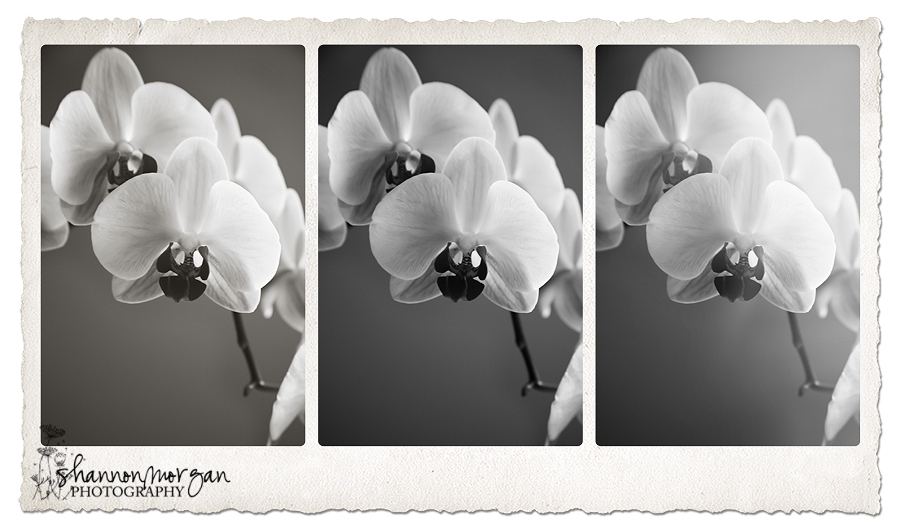
So I came up with these last night. I want to hang three large canvases in my TV room above my couch. I want it to be subtle, sophisticated, and serene.
Do you think this works, be honest. And which composition do you like better?
Also, I am thinking I might do a give away of one of these prints....stop back by for more details on how you could win!

Any and all opinions are appreciated :)!
And just because we all know that I love color :)!


5 comments:
Both are stunning. I like the bottom one. I think the comp is better. The main flower draws my attention more quickly. And, it almost looks like the flower has a....FACE!
I like the first one!! The second one-for some silly reason looks like a bug ( I think it has to do with the center of the flower being so "centered" in the photo). The color option is gorgeous but the black and white is more neutral and serene looking... just my opinion : )
I like the first one best!
beautiful! My favorite is the third picture in the first section!
All good. I love everything you do. The first B&W's are nice, classic, and serene but the first color print looks uniquely yours. If it were my house I'd want the first color one. Perfect colors and it has ... personality. It draws me in more. But I'd be interested to see a color triptych similar to the B&W one you put together. Cheers.
Post a Comment